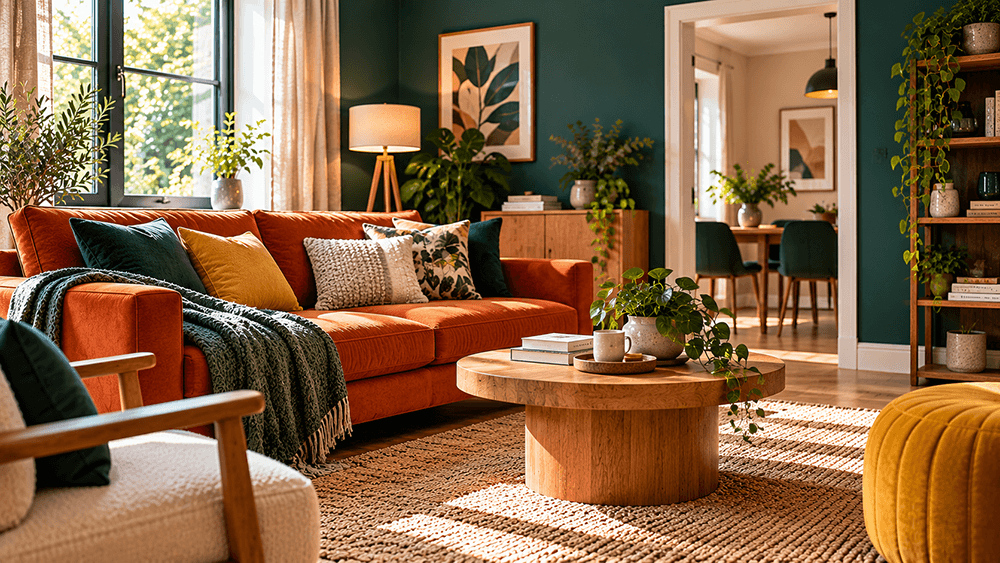
Choosing colours for your home can be one of the most enjoyable parts of decorating, but it can also become surprisingly difficult. A shade that looks perfect on a paint chart may feel completely different once it covers an entire wall, and colours that work beautifully in one room may clash with those used elsewhere.
Creating a coordinated interior does not mean painting every room the same colour. In fact, some of the most interesting homes combine rich greens, deep blues, warm terracotta, muted pinks and other distinctive shades.
The secret is finding a balance between individuality and consistency. With a little planning, it is possible to introduce plenty of colour while ensuring that different rooms still feel connected.
Start With the Atmosphere You Want to Create
Before looking at paint colours, think about how you want each room to feel.
A living room might benefit from a warm, welcoming atmosphere, while a bedroom may need to feel calmer and more restful. Kitchens can often accommodate stronger colours, particularly when cabinetry, worktops and flooring provide some contrast.
Consider the purpose of each space and how it is used throughout the day.
For example, a deep forest green can make a living room feel cosy and sophisticated, while a brighter sage green may create a fresher appearance in a kitchen or dining room.
There is no single correct colour for any particular room. The aim is to choose something that suits both the space and the people using it.
Build a Colour Palette for the Whole Home
Rather than choosing colours for every room independently, start with a small collection of shades that work well together.
A practical whole-home palette might include:
- one or two neutral background colours
- two main colours used across several rooms
- one or two stronger accent colours
- consistent wood and metal finishes
For example, warm white, deep teal, olive green, terracotta and natural oak can create a coordinated palette without making every room look alike.
A living room might feature teal walls and warm timber furniture, while the kitchen uses olive cabinetry with terracotta accessories.
The colours do not have to appear in equal amounts. Repeating them in different proportions helps create continuity.
Understand Warm and Cool Colours
Colours are often described as warm or cool, depending on their underlying tones.
Warm colours include many shades of red, orange and yellow, as well as creams and browns with golden undertones.
Cool colours often include blues, blue-based greens, violet shades and greys with blue undertones.
However, individual shades can behave differently. Some greens feel warm because they contain more yellow, while others appear cooler because they lean towards blue.
Understanding these differences can help when combining paint with existing furniture, flooring and fittings.
For example, a cool grey wall may not sit comfortably beside a very warm beige floor. A warmer grey or soft neutral could create a more harmonious result.
The easiest approach is to compare samples directly rather than relying entirely on colour names.
Consider Natural Light Before Choosing Paint
Natural light has a major influence on how colours appear.
A bright south-facing room may make certain shades appear lighter and warmer, while a north-facing room can make colours look cooler or more subdued.
The appearance also changes throughout the day.
A rich blue might look vibrant in afternoon sunlight but become much darker in the evening. Similarly, a warm cream could appear almost white in strong daylight but noticeably yellow under some artificial lighting.
Before making a final decision, place several samples on different walls and observe them:
- in the morning
- around midday
- during the afternoon
- under artificial lighting in the evening
This can prevent disappointment after the room has been fully decorated.
Do Not Be Afraid of Bold Colours
Neutral interiors can look attractive, but they are not the only way to create a comfortable and stylish home.
Deep greens, navy blues, burnt orange, mustard yellow and rich burgundy can all work beautifully when combined thoughtfully.
<text color=”default”>The important consideration is balance.</text>
If a room has dark green walls, lighter flooring, pale upholstery and natural timber can stop the space from feeling too heavy.
Similarly, a terracotta feature wall might work well with cream furniture, dark metal details and green plants.
Strong colours do not necessarily make a room feel smaller or uncomfortable. The overall effect depends on lighting, furniture, proportions and how different elements interact.
For anyone uncertain about using bold colours, smaller areas such as alcoves, shelving, internal doors or individual pieces of furniture can be a useful starting point.
Use the 60–30–10 Principle as a Guide
One popular decorating approach is to divide the room’s colour scheme into three approximate proportions:
- 60% dominant colour: Usually walls, large furniture or other major surfaces
- 30% secondary colour: Upholstery, curtains, cabinetry or rugs
- 10% accent colour: Cushions, artwork, accessories or smaller details
For example, a living room might combine warm off-white walls, a deep blue sofa and mustard yellow accessories.
This is not a strict design rule. Some interiors work beautifully with much more adventurous combinations.
However, it can provide a useful starting point when several colours are competing for attention.
Create Connections Between Different Rooms
A home can contain rooms with very different colour schemes and still feel coordinated.
One of the easiest ways to achieve this is by repeating certain colours or materials.
For example, a bedroom with muted blue walls could include a small amount of terracotta in its cushions or artwork. The same terracotta might then appear more prominently in a neighbouring hallway.
Other elements can provide continuity too.
Similar timber tones, door finishes, skirting colours or flooring materials help visually connect spaces even when the wall colours change.
This is particularly useful in open-plan homes where several areas are visible at once.
Think Beyond Wall Paint
Wall colour is only one part of an interior scheme.
Furniture, flooring, curtains, tiles, worktops and even door handles contribute to the overall appearance.
A room with neutral walls can still feel colourful through upholstered furniture, patterned rugs, artwork and decorative accessories.
Equally, richly coloured walls may benefit from relatively simple furniture and textiles.
When decorating an existing home, consider which items are staying before choosing the paint.
A large sofa, timber floor or fitted kitchen is often more expensive to replace than the wall colour, so it makes sense to use those elements as the foundation of the palette.
Use Colour and Texture Together
Colour becomes more interesting when combined with different materials and textures.
For example, a dark blue room might include:
- oak furniture
- linen curtains
- a textured wool rug
- ceramic accessories
- brushed brass lighting
- soft upholstered seating
Even when several items share similar colours, their different surfaces help create depth.
Natural materials such as timber, stone, cotton and linen can also soften the appearance of stronger colours.
This approach is especially effective when you want a room to feel warm and comfortable rather than overly polished.
Be Careful With Colour Trends
Interior colour trends change regularly, and it can be tempting to redecorate every time a new shade becomes fashionable.
However, a colour that looks impressive in photographs may not suit the lighting, furniture or character of your own home.
Instead of following trends exactly, look for elements that appeal to you personally.
If you love dark green, for example, it may be a good long-term choice regardless of whether it happens to be fashionable at the moment.
Trends can still provide useful inspiration, particularly for smaller accessories that are relatively easy to change.
The goal should be a home that feels comfortable and personal rather than one designed entirely around the latest style.
Test Colours Before Decorating the Entire Room
Paint samples are relatively inexpensive compared with the cost of repainting a completed room.
Where possible, test your preferred shades over a reasonably large area or on movable sample boards.
Small colour swatches often make it difficult to judge the true effect.
It is also worth considering the paint finish. Matt, eggshell and satin surfaces can reflect light differently, changing how the colour appears.
Check that the chosen finish is suitable for the room, particularly in kitchens, bathrooms and busy family spaces where cleaning and moisture resistance may be important.
Make Changes Gradually
You do not need to redecorate the entire property at once to create a consistent colour scheme.
Starting with one room can help establish the direction for the rest of the home.
Once that space is finished, consider which colours or materials could be repeated elsewhere.
A deep teal living room might inspire a similarly coloured kitchen accessory, a hallway artwork or a bedroom cushion.
Gradually building connections between rooms can produce a more natural result than trying to make every decorating decision at the same time.
Final Thoughts
Choosing interior colours is about more than finding individual shades that look attractive.
The most successful schemes consider natural light, existing materials, room proportions and the atmosphere you want to create.
A coordinated home does not have to rely entirely on neutral colours. Rich greens, warm terracotta, deep blues and other expressive shades can work beautifully when supported by complementary materials and a few repeated details.
Taking time to test colours and plan how different rooms connect can help create a home that feels both individual and harmonious.
Above all, choose colours that you genuinely enjoy living with. A thoughtfully decorated home should reflect your preferences rather than simply follow a particular trend.